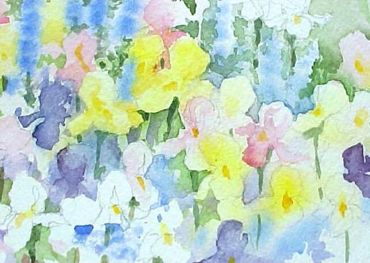


| Painting Positive and Negative Flower Shapes Foreground / Close-up Garden Details |
Page 2 Positive and Negative Flower Shapes
Page 3 Positive and Negative Flower Shapes
Page 4 Positive and Negative Flower Shapes
Page 5 Positive and Negative Flower Shapes
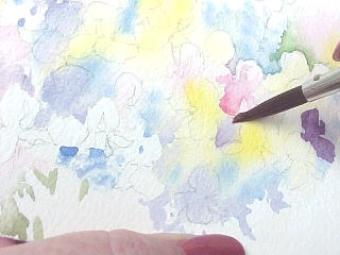
1. It's not necessary to wet the
whole page when starting to paint
your flowers, just wet a workable
section. The paper should be
damp not shiny wet.
whole page when starting to paint
your flowers, just wet a workable
section. The paper should be
damp not shiny wet.
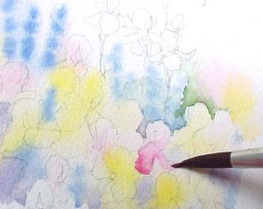
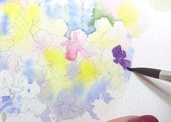
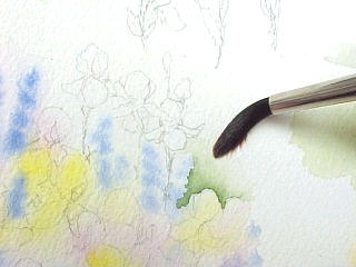
2. Using a round brush drop or
dabble various colors. This is
called "charging" the area with
color.
dabble various colors. This is
called "charging" the area with
color.
3. When the color is dropped onto
damp paper the edges are soft or
blended. These sharp edges you
see indicate where the paper was
dry not damp. Some of both is
good. This works really well for
indicating white flowers. Just paint
around the shapes.
You could draw them in first but
the pencil lines are hard to erase
after the water and paint cover the
pencil lines.
1.
5.
4.
2.
3.
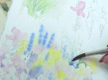
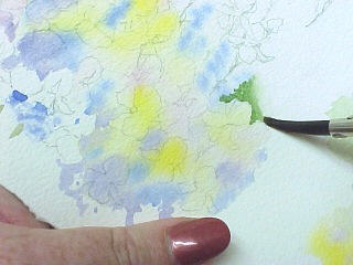
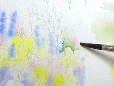
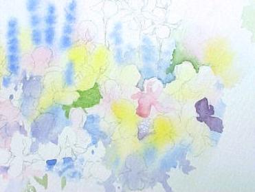
4. and 5. When dry, pencil in the
shapes of the flowers indicated by
the colors. Larger color shapes
can be made into more that one
flower. I also added white flowers
at the top to paint later.
shapes of the flowers indicated by
the colors. Larger color shapes
can be made into more that one
flower. I also added white flowers
at the top to paint later.
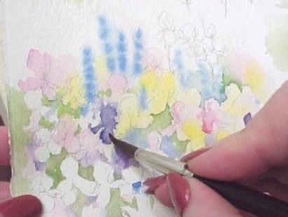
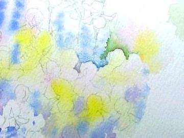
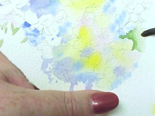
Negative painting is a process of applying paint to the area around or
behind the object you are wanting to depict. Since the white of the
paper showing through the transparent colors is the way we paint light
colors, in order of the make these light colors stand out you must
paint the negative space next to them. Keep in mind that even though
it is negative to one shape it could be another flower that is a positive
shape.
| 6. |
| 7. |
| 8. |
| 9. |
| 10. |
7. Next, with a damp brush using clear water, I wet the
paper next to the color so the color bleed or blends into the
dampened area which softens the edge of the green color.
If I have too much water in my brush it will run into the green
color instead of the green running into it.
paper next to the color so the color bleed or blends into the
dampened area which softens the edge of the green color.
If I have too much water in my brush it will run into the green
color instead of the green running into it.
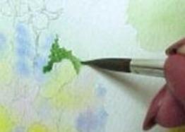
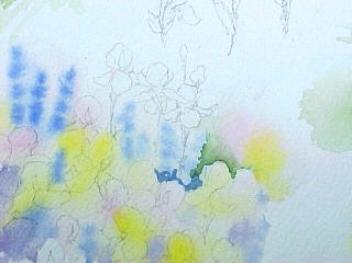
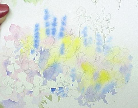
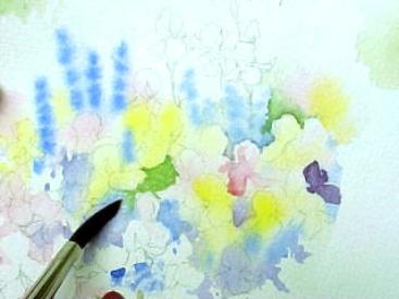
6. This is an example of how to start painting a negative space
around one of our flowers.
around one of our flowers.
(I will be using a couple of #8 round synthetic brushes. One
with color and one with clear water to use for blending.)
With the pencil line as a guide, on DRY paper, paint close to
the pencil line using a brush with a good point. Keep in mind
other neighboring flowers that may be bordering this same
negative space.
with color and one with clear water to use for blending.)
With the pencil line as a guide, on DRY paper, paint close to
the pencil line using a brush with a good point. Keep in mind
other neighboring flowers that may be bordering this same
negative space.
8. and 9. Extend the clear water damp brush blending out
away from the green paint to keep the newly painted
negative space light in color. After this dries you can paint
something else in this area if you want to.
away from the green paint to keep the newly painted
negative space light in color. After this dries you can paint
something else in this area if you want to.
10. Before it dries you can also drop additional color into
this damp area. Be careful not to add more wetness just
color.
this damp area. Be careful not to add more wetness just
color.
| 11. |
| 13. |
| 12. |
11. Yellow added to the damp area. Using the blue
from the neighboring flower blue paint starts the
negative painting at the top edge of the pink flower
and the lower petal of the yellow flower.
from the neighboring flower blue paint starts the
negative painting at the top edge of the pink flower
and the lower petal of the yellow flower.
12. Using the clear water blending brush, dampen
the area. It doesn't hurt to allow the paint to overlay
the underpainting. This is called glazing, when one
layer of color is applied over another.
the area. It doesn't hurt to allow the paint to overlay
the underpainting. This is called glazing, when one
layer of color is applied over another.
13. The edge is there for the lighter pink flower but
the blue is blended into clear water over the blue one.
the blue is blended into clear water over the blue one.
14. Now, lets add a positive shape into the mix. Be sure
the area is dry, then add the color on top of the flower
instead of behind it. Again, blend it with the damp brush
to keep the edge soft INSIDE the flower. Using the damp
brush to model on move your paint works well with the
light colors.
the area is dry, then add the color on top of the flower
instead of behind it. Again, blend it with the damp brush
to keep the edge soft INSIDE the flower. Using the damp
brush to model on move your paint works well with the
light colors.
| 14. |
| 15. |
15. Note the positive shape on the bottom of the
pink flower and the negative edge at the top.
pink flower and the negative edge at the top.
| 16. Adding a Positive Shape |
| Filling in a Negative Area with purple paint |
| 18. Green negative space is filled in |
| 19. Blending the green and extending the negative area |
| 20. |
| 21. |
20. More negative green spaces are shown above.
I painted them green so they could be easily identified.
Other colors could have also been used.
I painted them green so they could be easily identified.
Other colors could have also been used.
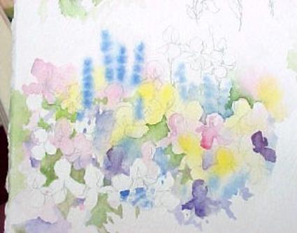
22. Here is a closer look
at the shapes and colors
of a portion of this flower
patch. Some of the pencil
lines have been erased to
show the shapes that still
need work.
Look for the positives and
negatives and how they
can be used together in
the same flowers to
create depth and contour.
The variety and interest
this adds will create a
more realistic look.
23. Almost complete!
Just a few more touches
and it's done.
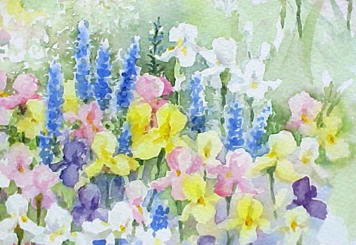
| ©2002-2009 Susie Short Studio LLC - All Rights Reserved - www.susieshort.net/watercolor-tips.html Page 5 of 5 |
| 22. |
| 23. |
©2002-2009 Susie Short Studio LLC - All Rights Reserved - www.susieshort.net/watercolor-tips.html Page 4 of 5
©2002-2009 Susie Short Studio LLC - All Rights Reserved - www.susieshort.net/watercolor-tips.html Page 3 of 5
©2002-2009 Susie Short Studio LLC - All Rights Reserved - www.susieshort.net/watercolor-tips.html Page 2 of 5
©2002-2009 Susie Short Studio LLC - All Rights Reserved - www.susieshort.net/watercolor-tips.html Page 1 of 5
Hint: Controlling the amount of water in the mix and in your brush is important.
| Notice the white irises above and below. Notice how those below stand out even though the green behind them is pale in value. |

21. Another purple positive shape is added.
> <
| 17. |